
How to Choose the Right Photos for Your Therapy Website (Without Spending a Fortune)
Here's something I hear constantly from therapists who are building or refreshing their websites: "I don't have any good photos."
And what usually follows is one of a few things. They freeze up and put the whole project on hold until they can book a photographer. They grab whatever happens to be on their phone from a work event two years ago. Or, and this one is so common, they go hunting through the same handful of stock photo websites everyone else uses and end up with the woman meditating on the beach. You know the one.
I get it. Photos feel hard. They feel expensive, and they feel like something you need to get exactly right before you can move forward. But here's what I've learned working with therapist after therapist on their websites: you don't need a perfect photo library to have a beautiful, trustworthy site. You need a thoughtful one.
This post is about building an imagery strategy for your whole website — not just your headshot — that feels cohesive, authentic, and genuinely like you, even if you're working with a tight budget or starting basically from scratch.
First, Let's Talk About What Photos Actually Do on a Therapy Website
Before we get into the how, it helps to understand the why, because photos on a therapy website aren't just decoration. They're doing real work.
Images communicate your vibe before a single word is read. They tell someone whether your space feels warm or clinical, calm or energizing, approachable or formal. They help a potential client answer the question they're really asking when they land on your page: does this feel safe? Does this feel like me?
Research consistently shows that people form first impressions within seconds — and those impressions are driven overwhelmingly by visuals, not words. So while your copy matters enormously, your images are often what get someone to slow down and actually read it.
That's why a generic, mismatched, or clearly stock-ish photo library can quietly undermine an otherwise good website. And why even a small collection of intentional, cohesive images can make a huge difference.
The Two Categories of Images Your Website Needs
Most therapy websites need two kinds of images working together: photos of you, and supporting imagery that sets the tone and fills out the visual story.
Photos of you are non-negotiable. Clients are choosing a person, not a service. They need to see your face. If this is where you're stuck, I've written a whole post specifically about headshots and about page photos, including how to get great ones without a big budget, so I'll point you there for the deep dive on that piece.
Supporting imagery is everything else: the photos that live in your homepage hero, your service pages, your blog headers, your contact page. These images set the emotional tone of your site and give it visual breathing room. They don't have to be photos of you, but they do need to feel like you. This is what we're really talking about today.
The Stock Photo Problem (And How to Solve It)
Let's address the elephant in the room: most therapy websites lean heavily on stock photos, and most stock photos for therapy are genuinely terrible.
You know the ones. The disembodied hands. The person crying artistically on a couch. The silhouette staring at a sunset. The abstract brain made of colorful puzzle pieces. These images are everywhere, they mean nothing to anyone, and they have a way of making every therapy website look exactly like every other therapy website.
The problem isn't stock photos themselves — it's generic stock photos chosen without intention. There are actually some incredible free and low-cost stock photo libraries out there with images that feel warm, human, and specific enough to actually support your brand. You just have to know where to look and what to look for.
Free resources worth bookmarking:
Unsplash, Pexels, Nappy, and Gratisography are the ones I recommend most often. The Noun Project and Humaaans are great for searching for divers illistrations and icons. They're completely free, regularly updated, and have a much broader, more lifestyle-oriented library than the traditional stock sites. You can search things like "cozy office," "morning coffee," "nature walk," "hands journal," or "warm living room" and find imagery that feels personal and grounded rather than clinical and cold.
Canva also has a solid free library built in, which is convenient if you're already using it for other things.
What to search for instead of "therapy":
This is the trick. If you search "therapy" or "mental health" in any stock library, you're going to get the sad couch photos. Instead, try searching for the feeling you want your site to evoke. Some of my favorite search terms for therapy websites: cozy interior, soft light, morning ritual, nature path, open journal, hands holding mug, quiet room, botanical, calm workspace. These images communicate safety and warmth without screaming "clinical setting."
Building a Cohesive Visual Story on a Budget
Here's where a lot of DIY therapy websites fall apart — not because the individual photos are bad, but because they don't belong together. You've got a moody forest shot on the homepage, a bright airy kitchen on the about page, and a corporate-looking stock photo on the contact page, and the whole site ends up feeling scattered and disjointed.
Cohesion is what separates a website that looks polished from one that looks thrown together, and you can absolutely achieve it without a professional photographer or a design background. Here's how.
Pick a palette and stick to it. Before you choose a single image, get clear on the color family your website lives in. Warm neutrals? Soft greens and blues? Deep jewel tones? Airy whites and blushes? Once you know your palette, filter every image choice through it. If a photo is beautiful but the colors clash with your site, skip it. This one habit alone will dramatically elevate the visual consistency of your website.
Choose a consistent mood. Bright and airy, warm and moody, clean and minimal — pick one and commit. A site that mixes high-contrast dramatic photography with soft pastel lifestyle shots feels visually restless, even if the viewer can't quite name why. When in doubt, err on the side of more cohesion over more variety.
Limit your sources. If you're pulling from multiple stock libraries, you'll often end up with images that have subtly different visual treatments — different color grading, different levels of saturation, different editing styles. Where possible, try to pull the bulk of your stock images from one or two sources so they naturally feel more related to each other.
Let your personal photos anchor everything. Even one or two genuine photos of you — in your office, outside, doing something that feels like you — gives the whole site a warmth and realness that no amount of beautiful stock photography can replicate. Those personal images become the emotional center of your site. The stock photos support and surround them.
Visual Variety: Give Your Eyes Somewhere to Rest
Here's where it gets a little more nuanced, and where even well-intentioned, cohesive websites can still fall flat.
Once people find a palette and mood that works, there's a natural tendency to go all in on one type of image. Every photo ends up being a wide landscape. Or every photo is a tight close-up of hands or objects. Or every single image has a person in it. And the result, even when each individual photo is beautiful and on-brand, is a site that feels visually monotonous. Your eye doesn't know where to land, so it kind of glazes over everything and keeps scrolling.
The fix is thinking about your image library as a whole, not just as individual choices. A well-rounded therapy website needs balance across a few key dimensions.
Zoomed in versus zoomed out. Wide shots establish a sense of space and environment… a cozy office, a quiet trail, a calm living room. Close-up shots create intimacy and draw attention to detail… hands wrapped around a mug, an open journal, a plant on a windowsill. You need both. A site full of only wide shots feels distant and impersonal. A site full of only close-ups can feel claustrophobic. Alternating between them gives the eye a natural rhythm to follow down the page.
People versus no people. Photos of people, especially of you, create warmth and human connection. But when every single image on the site contains a face or a figure, the visual experience starts to feel heavy and emotionally intense, which is the last thing you want someone to feel when they're already nervous about reaching out. Non-people images like nature, objects, spaces, textures… give the eye a place to breathe and rest between the more emotionally loaded imagery. Think of them as the quiet moments in a piece of music. Necessary, not empty.
Busy versus open. Images with a lot of generous negative space, a simple sky, a plain wall behind someone, a clear tabletop… are incredibly useful on websites because they give text room to breathe and don't compete visually with your copy. If every image on your site is visually dense and detailed, your pages will feel overwhelming even when the layout itself is clean. Look for at least a few images where there's real openness, especially anywhere you'll be layering text on top of a photo.
A simple gut check before you finalize your image library: scroll slowly through your whole site and notice where your eye wants to stop versus where it just keeps moving. If it never stops, you need more variety. If it stops so constantly it feels exhausting, you have too much competing for attention at once. What you're looking for is something closer to a slow exhale. Calm, considered, and easy to be in.
What to Put Where: A Simple Page-by-Page Guide
Homepage hero image. This is the most important image on your site, and the first thing people see. You want something that immediately communicates the feeling of working with you. A warm, calm environment. A serene outdoor space. Your own face, if you have a good photo to use here. The goal is simple: someone lands on this page and something in them settles.
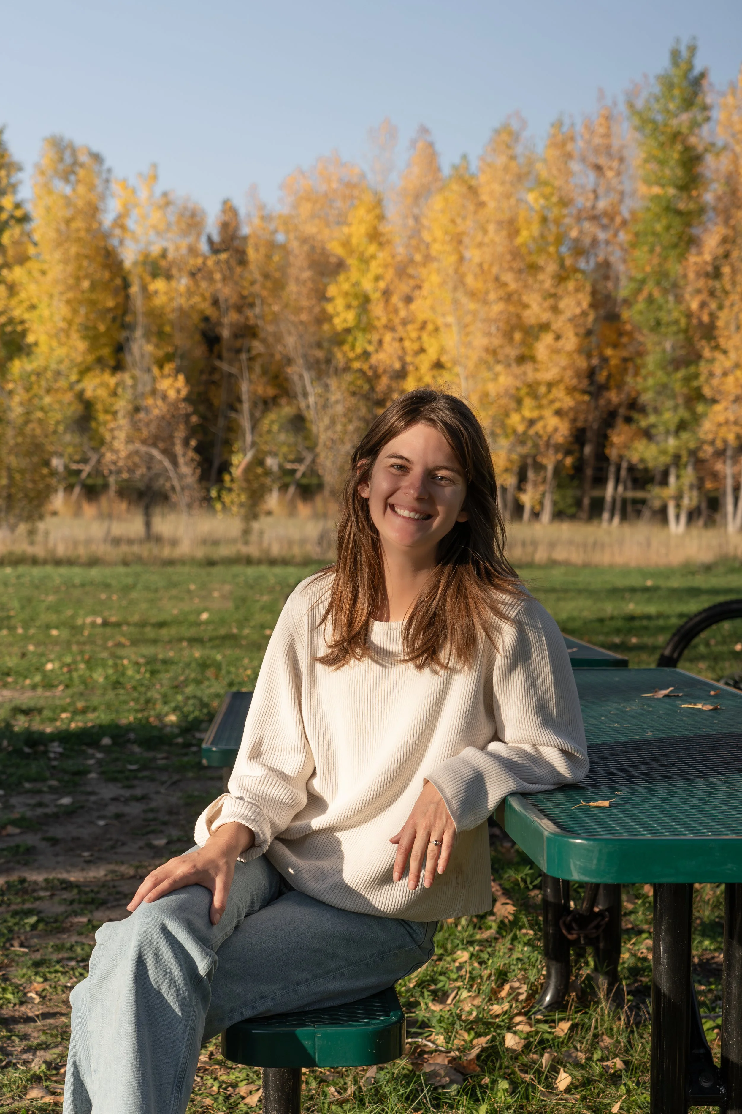
About page. This is where you absolutely need photos of yourself, and more than one if possible. A classic headshot plus something a little more relaxed and personal. This is the page where people are deciding whether they trust you, and they can't do that without actually seeing you. More detail on this in the headshots post.
Service or specialty pages. These pages benefit from imagery that evokes the emotional experience of your specific work. If you do trauma therapy, something calm and grounding. If you work with kids, something a little more playful and bright. If you specialize in anxiety, something that communicates both the weight of it and the relief of getting support like being able to sit down and enjoy a good book without your brain running through a list of to-dos. These don't have to be therapy photos. Think about the emotion you want to evoke and search for that feeling.
Contact page. Often overlooked, but really important. Your contact page is where someone is working up the courage to actually reach out. A warm, approachable photo of you here, even just a simple smiling headshot, goes a long way. It's a small thing that makes a real difference at exactly the right moment.
Blog post headers. Consistency matters here more than perfection. Pick a visual style for your blog headers and repeat it. Some people use a solid color background with text. Some use lifestyle photography. Some apply a consistent filter to all images. Whatever you choose, keeping it consistent makes your blog feel like a cohesive body of work rather than a collection of random posts.
A Few Things to Avoid
Images that don't match your niche. If you work exclusively with adolescents, a homepage full of stock photos of older adults sends a confusing signal. If you specialize in grief work, extremely bright and cheerful imagery might feel tonally off. Think about who your ideal client is and whether the images on your site would actually resonate with them.
Too many images. More is not better. A few well-chosen, cohesive images are far more effective than a photo-heavy site that feels busy and overwhelming. White space is your friend. Let your images breathe.
Low resolution photos. Always download the largest file size available from stock sites. Blurry or pixelated images immediately read as unprofessional, even when everything else on the site is thoughtful and well done.
Heavily filtered or edited photos of yourself. A heavily filtered headshot that doesn't look like you in person creates a subtle disconnect for clients. When someone walks into your office and you look noticeably different from your photo, it introduces a tiny note of uncertainty at exactly the moment you want them to feel settled and safe.
The Bottom Line
You don't need a big photography budget to have a website that feels warm, trustworthy, and distinctly yours. You need intentionality. A clear visual palette. A consistent mood. Enough variety that the eye has somewhere to rest. And a few genuine photos of yourself as the emotional anchor that holds it all together.
Your images are telling a story before your words ever get the chance to. Make sure it's the right one.
Need Help Pulling It All Together?
If you're staring at a folder of mismatched photos wondering how to make them work, or starting from scratch and not sure where to begin, that's exactly the kind of thing we love helping with. Part of our design process is working through your imagery with you, helping you identify what you have, what you need, and how to pull it all into something that feels cohesive and genuinely like you.
If any of this resonated, even just a little, we'd love to hear from you! Whether you're ready to dive in or just starting to think about what a website refresh might look like, you don't need to have it all figured out before we talk. No vision board, no brand guide, no clear sense of your niche required. We'll get into the good questions, hear about your practice, and see if working together feels like the right fit.
No pressure, no pitch, no homework before you show up. Just a conversation.
About The Author
Alexis Ryan is a designer, copywriter, brand strategist, and licensed therapist. She runs Healing Hearts Creative full time, helping mental health professionals build websites that feel like them, and maintains a small private practice of her own. She brings over 15 years of marketing and design experience to this work, alongside a deep understanding of what it actually takes to build a practice worth showing up for.